

Scotts Miracle-Gro has the largest market share in the household lawn and gardening industry, selling a wide variety of lawn and gardening products to mainstream customers. They believe every lawn owner can take care of their lawn with some guidance and provide do-it-yourself bundles. If you have any huge yellow bags piling in your garage, you must be very familiar with their brands.
Heady has been Scotts’s external mobile product team for multiple years. We develop and maintain a series of their digital apps including My Lawn, My Garden, and Home Grown. This time, they came to us with an ambitious vision — migrating their native apps to a cross-platform solution, Flutter. They wanted to rebuild the infrastructure with a centralized codebase and database and achieve a shorter development cycle.

Lawn maintenance is widely assumed as a specialized field that requires a broad range of knowledge and expertise to perform lawn care activities. And yet, our client doesn’t think that way.
My Lawn app has been long positioned as a direct marking tool to advertise products and subscriptions to new customers. However, this value proposition diverged from what users thought it should be. Many users downloaded the app and expected to 1) manage their lawn subscriptions with Scotts and 2) log their lawn maintenance activities. As soon as they found out the app didn't meet their expectation, they uninstalled the app and left angry reviews.
Given that, we repositioned the My Lawn app as a lawn care problem solver that our users can lean on. Besides, it should be a lawn care educational tool that teaches our customers how to take care of their lawns, when to water, and what actions they shall take when seeing any signs of an unhealthy lawn. They can journal about their lovely lawn in this app and get burning questions answered while spending some money on it.

Here is how I typically onboard myself to a new project — identify a list of research directions and do extensive desk research. In this case, there were 3 things on top of my head:
I started with reading articles from lawn care websites and online forums (e.g., the Lawn Forum, r/lawns) and watching Youtube videos on lawn care to gain domain knowledge and understanding of our users. While doing so, I collected their problems, needs, and habits to empathize with our users.
To understand the business, I consulted our PM, the librarian of the app. I also listened to their earning calls which was a valuable resource to probe business strategies and challenges from publicly traded companies. These helped me strategize product decisions and identify new app opportunities to satisfy both business and users.
We have a group of passionate users who are very vocal about what they love or hate in the app. Although I didn’t have the luxury to talk to our user group regularly, I crunched through all the customer support data and app reviews to learn about their struggles and feel connected with them.

As the sole product designer in this redesign, my design sprints looked like this: on Monday, my PM briefed me on feature requirements, and I asked her millions of questions to know the inside out. After that, I developed low-fi designs and ran a design critique with my design lead. Since very little time was left for validating the assumptions, I made my best shots by tapping into PM's knowledge and trusting my gut feelings. On the following days, I made a few iterations based on the feedback, pushed designs to higher fidelity, and presented to my PM by the end of the week. If things look good, we scheduled a client review the next week to finalize the design.
Our data showed that a more personalized experience could increase the retention rate. Thus, we reserved the most valuable screen real estate on the home page for the marketing team to communicate strategically with each user. They can compose journeys to either convert non-subscribed users to subscribed users, share personalized lawn care tips for retention or call for action.

A dedicated website for Scotts Lawn Care Program had charted a course for lawn care subscription, and thus the My Lawn app had to follow their steps to provide a seamless experience across platforms. I mapped out all subscription-related user scenarios such as moving to a new location, changing shipping address, getting a refund for a product, notified for a separated package, the list goes on, and design features for them. After many too-early-to-talk-about-this types of conversations with my PM, I created user flows to give us peace of mind.

There is always a tricky balance to design experience for users with different levels of prior knowledge — lower the barrier of lawn care but not oversimplify it so that our users understand the why; inspire users who have lawn care expertise while taking care of newcomers. Thus, how to surface relevant information in bite-size at the right time becomes one of our biggest challenges.
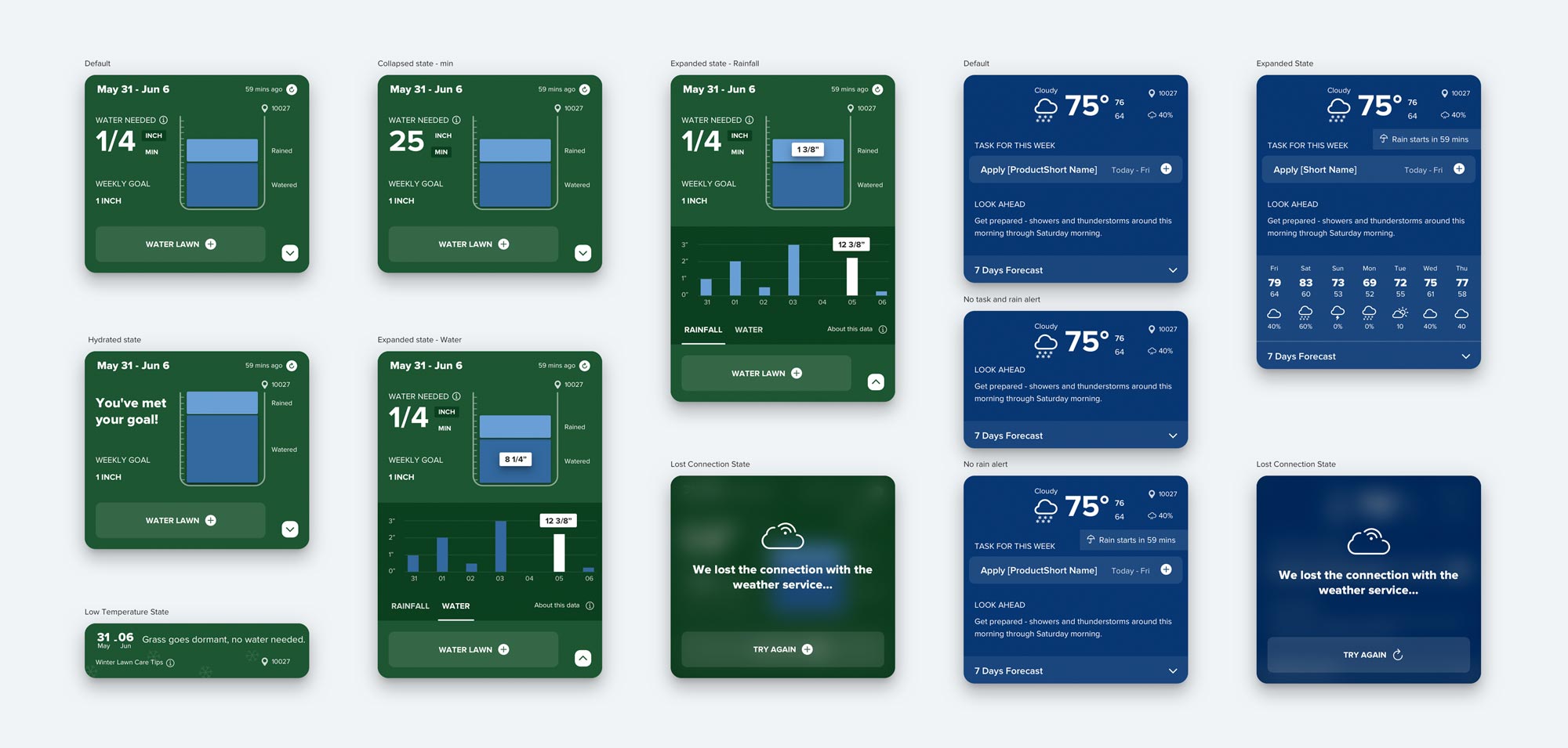
The No.1 question the customer support team received was: how long should I water my lawn to get an inch. In the new design, we did all the heavy lifting in the backend and asked users for their nozzle type to convert watering time for them. Mystery solved!
Lawn owners like to log their lawn activities on the app for their future records. Saying they just finished mulching a bed, they can add a mulching activity with a date and a line of description. We found out that these activity screens could be the perfect place to upsell mulch products since they are the right people who usually do the task and need relating products. Boom, we connect the right product to the right mind!
We devoted a navigation tab to a calendar so users can access their activity log effortlessly. They can browse activities based on categories, get sneak peeks of each task with all the necessary information, and jump to different periods with a couple of clicks. They left us because their activity log was gone in a previous release, and we worked hard to win their hearts back.

In an afternoon, I tuned in to Scotts 2020 Q3 earning call, hearing them talking about how their marketing team wanted to move mulch inventory. Meanwhile, I happened to be redesigning the lawn activity screens, such as mulching beds. All of the sudden, it stroke me that the activity pages could be the perfect spot to promote mulch products to the right people at the right time. Users on the mulch bed screen are the people who perform the activity; they have the right intention and the need. Isn’t this the least obtrusive way to serve an ad? Feeling exhilarated, I mapped out all the relevant products that can be promoted on each activity and prototyped all the screens.
When we presented new lawn activity screens to the clients, they were mind. blown. It was such an obvious connection, and yet no one has ever thought about that. We hit the jackpot! I was very proud to see my design killing two birds with one stone: it solved the user problems and created new business opportunities.

I wish there were time to do user testings before handing off designs to devs. As an external partner, we could only alter much about the waterfall process. And only when months later you found out that a feature looked so different from the original design, you realized some assumptions baked in my design were wrong.
I felt fortunate to have this chance to reshape the entire app. This project was such an overhaul, and my hands were involved in 90% of the screens (roughly 440 screens produced)! I’m proud of the work the team achieved together and can’t wait to see how users respond to the new release on App Store and Google Play (coming out soon)! Shameless plug — if you have a lawn, I highly recommend you download the app, and please leave app reviews or share your thoughts with me. I’m curious!


